.jpg)
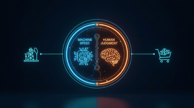
At LexData Labs, we process millions of data points every day. Inference results, confidence scores, drift metrics, and annotation throughput statistics flow through our pipelines continuously. But raw data, no matter how voluminous, is useless if it cannot be understood.
The bridge between raw data and actionable insight is visualization. For us, data visualization isn't just about making pretty charts; it's a critical engineering discipline that determines whether a model drift event is detected in minutes or missed entirely.
The Challenge: Seeing the Invisible
Machine learning models are notoriously opaque. When a model's performance degrades in production, it rarely fails with a loud bang. Instead, it drifts silently. A confidence score drops by 2%. A specific class of "pedestrian" starts getting misclassified as "cyclist" in rainy conditions.
"To fix a model, you first have to see what it's doing wrong. And to see what it's doing wrong, you need more than just a spreadsheet of F1 scores."
Our challenge was to build a visualization layer within our Insight Intelligence platform that could handle high-dimensional vector data while remaining intuitive for human operators.
From T-SNE to Action
One of our core tools is the embedding projector. By visualizing high-dimensional embeddings in 2D or 3D space using techniques like T-SNE or UMAP, we can literally "see" clusters of data.
In a recent update to our platform, we enabled interactive clustering. Users can now lasso a cluster of outliers—say, a group of images where the model is consistently confused—and immediately send that batch for re-annotation. This tightens the feedback loop from "seeing" a problem to "fixing" it.
Designing for Cognitive Load
Dashboard fatigue is real. An operations dashboard with 50 blinking red lights is just as useless as one with none. We follow three core principles in our UI design:
- Hierarchy of Urgency: Critical alerts (like rapid drift) must scream. Informational trends should whisper.
- Contextual Drill-Down: Every metric must be clickable. Seeing a drop in accuracy? Click it to see the specific images causing that drop.
- Temporal Continuity: AI systems change over time. Our visualizations always prioritize trend lines over static snapshots.
Designing interfaces that reduce cognitive load while maximizing information density.
The Future of Ops Viz
We are currently experimenting with generative UI—dashboards that adapt themselves based on the specific anomalies detected. If the system detects a data distribution shift, the dashboard automatically reconfigures to highlight distribution histograms. If it detects label inconsistency, it prioritizes confusion matrices.
This is the "Art" in our engineering. It's about empathy for the user who is responsible for the reliability of a critical AI system. By turning numbers into narratives, we empower them to make the right decisions, faster.
See your data clearly.
Experience the Insight Intelligence dashboard with your own data.
Start a Free Pilot