

Labeling · 6 min read
Visualizing dataset embeddings for quality control before training
A map of the depot dataset shows a pallet hiding in the forklift cluster, a knot of frames from one quiet minute, and a blank where the night shift should be.
Summary
This post lays a depot camera's dataset out as a two-dimensional map, each labeled crop a point placed by what it looks like, and reads the map before any training run: a mislabeled pallet inside the forklift cluster, a tight knot of near-duplicate frames from one minute of footage, an empty region where the night shift should be, and validation points sitting on top of training ones. It is for teams who want to know what a dataset holds before spending a training run on it.
Sheikh Srijon · GTM Lead · Oct 3, 2026
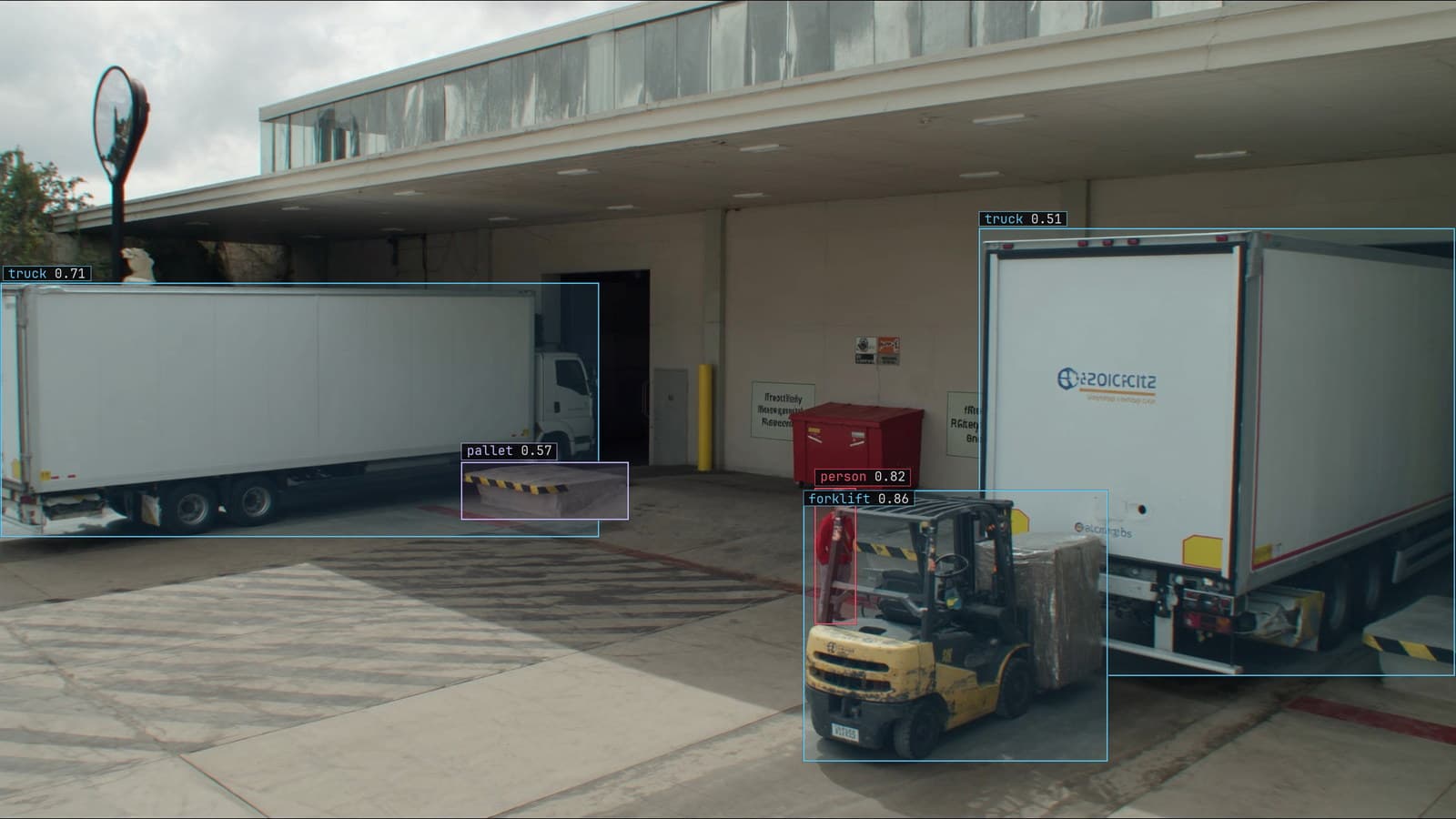
Loading dock with trucks at the bays, a forklift with a pallet, and a person boxed, generated scene with detections from our model
The dataset for the camera over dock 4 at the depot has a few thousand labeled crops in four classes, and the person about to train on it wants to know what is in it. Opening frames one at a time answers that slowly. Counting boxes per class answers it partially. Laying every crop out as a point on a map, placed so that crops that look alike sit near each other, answers it in one picture, and the picture on the dock dataset had four things wrong with it before anyone had run an epoch.
The map is made in two steps. Each labeled crop is passed through a general vision model that turns it into a long list of numbers describing its appearance. Those lists are then squashed from hundreds of dimensions to two, by any of the usual reduction methods, so they can be plotted. What survives the squashing is the neighbourhood structure: crops that were close in the long list are close on the page.
The plot is coloured by label. That is the whole tool.
Dimensionality reduction puts a wrong label inside the wrong cluster
The forklift crops on the dock map formed one large cluster, as they should. Inside it, coloured as a forklift and surrounded by forklifts, sat a handful of points that on inspection were pallets. Somebody had boxed the pallet on the tines and labeled the box as the forklift carrying it, on a run of frames from one Thursday afternoon. Those crops looked enough like forklift crops, tines and a bit of mast in every one, to land among them.
Outliers inside a cluster are labels to check. Points that sit in the wrong colour's region are the plainest kind: a crop labeled pallet, sitting deep in the forklift cluster, is either an unusual pallet or a wrong label, and a person can tell in a second. Points that sit between two clusters are the ambiguous crops, the ones the guideline may not have ruled on, and they are worth a ruling. The labeling guide makes the point that a plausible wrong label is accepted more often than a missed one is drawn in, and the map is one of the few ways to see the accepted ones.
The check on the dock set took an hour and found a few dozen labels to fix. A training run on the uncorrected set would have taken longer than the hour and learned that a pallet on tines is sometimes a forklift.
A knot of points is one minute of footage counted fifty times
The second thing on the map was a tight knot of forklift points, sitting almost on top of each other, denser than anywhere else in the cluster. They were fifty crops of the same forklift, parked at bay 3 with its engine off, from one quiet minute of the feed sampled every second. Fifty labels, one example.
Near-duplicates inflate every number. The class count says there are fifty more forklifts than there are. The validation score, if any of the fifty landed in the validation split, is scored partly on frames the model has effectively already seen. The footage lesson puts this as adjacent frames being near-duplicates and thirty frames a second being one scene sampled thirty times, and the map shows exactly where in the set that happened.
The fix is to keep a few and drop the rest, or to keep them all and know that they count as one. On the dock set the knot was thinned to three crops, and the class count fell by a number that was honest.
An empty region is a condition the set has never seen
The third thing was an absence. The forklift cluster for dock 4 had a dense side and a sparse side. The sparse side, when the points were opened, was the handful of night frames in the set: the same forklift under the sodium lamps, a pair of lights and an orange smear. Beyond the sparse side was nothing, a region of the map where a night forklift from a different angle or in rain would sit, if the set had one.
An empty region cannot be found by looking at labels, because there are no labels there. It can be found on the map because the map is drawn from appearance, and the shape of the cluster says which appearances are covered. On the dock set the empty region was the night shift, and the labeling batch chosen after the map was drawn was a few hundred night frames from the recorder, which filled it.
My own view is that this use of the map, finding what is missing, is worth more than finding what is wrong. A mislabel costs a little accuracy. A missing condition costs the whole night shift.
Somebody on the depot team printed the map before and after the night batch and pinned both in the office. The second one has a side the first one lacked.
Validation points on top of training points mean the split leaked
The fourth thing was only visible once the points were coloured by split instead of by class. Training crops in one colour, validation crops in another, and in a healthy split the two are mixed evenly across every cluster. On the dock 4 map they were mixed everywhere except the knot, where a dozen validation points sat directly on top of training points, because the fifty near-duplicates had been divided between the two splits at random.
That is leakage. The validation score on those points measures memory rather than generalisation, and it was flattering the model by a margin nobody had noticed. Splitting by time, so that a minute of footage lands entirely in one split, removed it, and the validation score fell to a number the live feed later agreed with.
The map is drawn again after every batch of corrections
The dataset does not stay still. Frames the dock model doubts come back to a person, the corrections become labels, and when they cross the project's threshold the model retrains on the larger set. Every one of those corrections is a new point on the map. The map after a month of corrections from dock 4 shows where they landed: in the sparse side of the forklift cluster, mostly, which is where the doubt was and where the set was thin.
Drawing the map again before each retrain repeats the four checks on the frames that arrived since the last one. A new knot means a quiet minute got sampled too densely. A new outlier means a correction was wrong. And a region that was empty and is now filling in is the loop doing what it is for, one doubted night frame at a time.
See it on your own footage.
Start with your footageMore in Labeling
Labeling · 7 min read
Aerial dataset augmentation for drone frames where there is no up
A tower seen straight down has no top or bottom, so rotations and both flips are safe. Scale for altitude, brightness for sun, move every box with its pixels.
Esdras Ntuyenabo · Oct 3, 2026
Labeling · 6 min read
A collaborative data annotation workflow run as a pipeline
Batch the bottling line's frames by camera and shift, assign so nothing is boxed twice, attach the guideline, review every label, train on the approved set.
Rajiya Sultana · Oct 3, 2026
Labeling · 7 min read
Dataset health check for computer vision, what to look at before anything trains
A scratch dataset where every scratch sits in the centre of the frame will train a model that looks in the centre. Five counts to read before the first epoch.
Rajiya Sultana · Oct 3, 2026